WONDER MAGAZINE SHOOTING AND EDITING DIARY : Issue 1 - July 2020
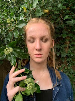
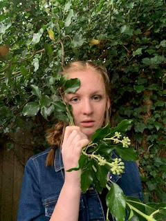 - When photographing for the cover of my the first issue of Wonder Magazine, I decided to shoot in the early evening as to avoid over exposed or brightly lit images (on a sunny or bright day). I applied quite a lot of makeup to my actor's face to allow a lack of shininess when the photos are taken. I also applied dark brown shimmering eye shadow and a bronzing powder to her face to give her a slight tanned and unkept/dirty appearance. This is to imply her character lived in a woodland area for some time in which she had to scavenge in the woods to survive the rough conditions. I kept her outfit very simplistic to imply a casual sense to her character as a teenager using dark colours to contrast the bushy green background, a black vest top and dark denim jacket.
 I spent time experimenting with different tree covered backgrounds in the photos until I captured the perfect cover image I wanted. Firstly I began with positioning her in front of a tree and then experimented with bushes
and large leaves in the background. I also attempted to test out images in which Rose held branches of the small trees in the background over her face to create a secretive sense to her personality in the television series advertised on the cover.
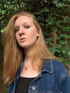
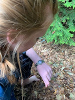
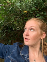 I also tried to use different facial expressions and poses for the actor as I was undecided on how serious I wanted her character to come across on the cover. I finally decided on quite an unreadable facial expression in the images with a slight glance at the audience. I captured some photos in which her eyes were closed showing off her dark eye makeup, photos in which direct address were used or photos where she glanced into the distance at a possible threat or shocking event. I will be adding some of these test shots onto the instagram page I created to accompany the magazine or even on the website as behind the scenes content for the readers to discover from the television series 'filming' itself. This is why I took photos in which she crouched down bare foot to imply she is now living on basics due to being without resources throughout her isolated months. In which she studies her watch or looks down on the ground or up at the sky, these will represent the behind the scenes photos in which taken on the 'film set' as actual television series events. I began capturing images in which the model has he hair in untidy french plaits but in the photograph I chose in the editing room for the cover has a natural and effortless feel as her hair is swept across on her head casually.
I used Adobe Photoshop's spot healing tool to blur the imperfections on her face and the dark shadows under her eyes as well as removing slight sideburns of hair. I used the brightening tool to brighten the dark shadows on the photograph chosen so the green colour is eye-catching behind her ginger hair.

 - When photographing and editing for the contents page of issue one of the magazine I decided to take the photograph in London but experimented with different backgrounds in the same area of Covent Garden. This is so I could choose my favourite and the most fitting photo for the page. I decided to use the photograph of the model in which it seems he is looking at the 'features' text highlighting it to the readers of the magazine. In the editing room I decided to edit out the brand logo from his jacket, using the spot healing brush to fade it as a magazine photograph would not include product placement unless it was an advertisement or sponsor for the clothing brand. I also faded the frown lines on the model's face as to smooth out his appearance and make his complexion seem clearer. I decided to take the photo in London as I felt it would allow me to gain a different and possibly more unique image than if I had taken it in my home town.On the right hand side I have attached an outtake from the photographing onto this page.
SHOOTING AND EDITING DIARY ISSUE 2 - OCTOBER 2020
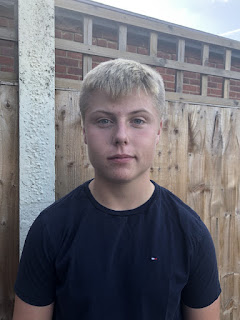
- When photographing for the issue two cover, I decided to photograph a male model using direct address as to look into the eyes of the reader. This is so the magazine will appeal to both the males and females in my 16-25 year old demographic, due to the female gaze and females or men who enjoy watching detective television programmes in which there is a leading male actor. I captured him with a straight, quite expressionless face to imply a seriousness to the character he plays in the television series he can be found in. Nothing is then given away in his expression about his personality as an actor or in the television show, whether he is professional or comical. I will be placing the photograph against a plain black or grey background as to give the magazine cover a contrasting feel to the other issue's.
I used Adobe Photoshop to edit the photograph I had chosen out of the three taken on the shoot, I used the spot healing brush to blur out the imperfections on his face. I also lightened the dark shad
ows over the model's face and used the eraser tool on Adobe Fireworks to erase the fence background behind him so the background is transparent and ready to apply to the black background of the magazine cover. Lastly when editing the photo I decided to use the paintbrush tool to lightly blur the logo on his t-shirt away, this is to give the magazine a professional sense. A magazine such as this would not include visible logos of brands unless it was a sponsorship and definitely not an Entertainment Magazine such as Empire. Beside the text is the unedited and then edited editions of the photograph.

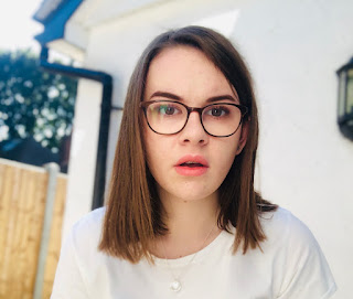 - When photographing for the issue two contents page I began by taking photographs of myself from afar by asking my sister to assist me with the camera. This did not seem to work as I did not achieve the photos up close and personal, desired effect. I then took to using the camera by positioning it on a wall and taking photos of myself by looking straight at the camera. I experimented with smiling, closed mouth serious and open mouthed photographs. In the final image selected I looked slightly to the side with my eyes positioned towards the reader with direct address. I had experimented with photos in which I looked straight ahead at the camera lens but decided it did not create the look I strived for. I used photoshop to brighten the photograph to highlight the pink of the lip colour I wore in the image. I am not smiling in the selected photograph from the shoot but have quite a natural expression on my face, which does not convey the personality of the actress presented on the page, the reader would have to read the website or the issue of the magazine further to discover more about her. I chose to use the setting of the wall at the back of my house, I feel the white background reflects the sun very well and lights up the image. I also like the outside vintage lamp/light on the wall behind the model's head as it breaks up the plain background and adds a slight unusual touch to the magazine content's location. This image will be in a small box above the contents page text and will be contrast to the plain black colour of the page. In the editing room I used photoshop to brighten up the model's face to then highlight the redness of her lips to the reader against the white colouring of the image.

 - When photographing for the cover of my the first issue of Wonder Magazine, I decided to shoot in the early evening as to avoid over exposed or brightly lit images (on a sunny or bright day). I applied quite a lot of makeup to my actor's face to allow a lack of shininess when the photos are taken. I also applied dark brown shimmering eye shadow and a bronzing powder to her face to give her a slight tanned and unkept/dirty appearance. This is to imply her character lived in a woodland area for some time in which she had to scavenge in the woods to survive the rough conditions. I kept her outfit very simplistic to imply a casual sense to her character as a teenager using dark colours to contrast the bushy green background, a black vest top and dark denim jacket.
 I spent time experimenting with different tree covered backgrounds in the photos until I captured the perfect cover image I wanted. Firstly I began with positioning her in front of a tree and then experimented with bushes
 and large leaves in the background. I also attempted to test out images in which Rose held branches of the small trees in the background over her face to create a secretive sense to her personality in the television series advertised on the cover.

 I also tried to use different facial expressions and poses for the actor as I was undecided on how serious I wanted her character to come across on the cover. I finally decided on quite an unreadable facial expression in the images with a slight glance at the audience. I captured some photos in which her eyes were closed showing off her dark eye makeup, photos in which direct address were used or photos where she glanced into the distance at a possible threat or shocking event. I will be adding some of these test shots onto the instagram page I created to accompany the magazine or even on the website as behind the scenes content for the readers to discover from the television series 'filming' itself. This is why I took photos in which she crouched down bare foot to imply she is now living on basics due to being without resources throughout her isolated months. In which she studies her watch or looks down on the ground or up at the sky, these will represent the behind the scenes photos in which taken on the 'film set' as actual television series events. I began capturing images in which the model has he hair in untidy french plaits but in the photograph I chose in the editing room for the cover has a natural and effortless feel as her hair is swept across on her head casually.
I used Adobe Photoshop's spot healing tool to blur the imperfections on her face and the dark shadows under her eyes as well as removing slight sideburns of hair. I used the brightening tool to brighten the dark shadows on the photograph chosen so the green colour is eye-catching behind her ginger hair.

 - When photographing and editing for the contents page of issue one of the magazine I decided to take the photograph in London but experimented with different backgrounds in the same area of Covent Garden. This is so I could choose my favourite and the most fitting photo for the page. I decided to use the photograph of the model in which it seems he is looking at the 'features' text highlighting it to the readers of the magazine. In the editing room I decided to edit out the brand logo from his jacket, using the spot healing brush to fade it as a magazine photograph would not include product placement unless it was an advertisement or sponsor for the clothing brand. I also faded the frown lines on the model's face as to smooth out his appearance and make his complexion seem clearer. I decided to take the photo in London as I felt it would allow me to gain a different and possibly more unique image than if I had taken it in my home town.On the right hand side I have attached an outtake from the photographing onto this page.
SHOOTING AND EDITING DIARY ISSUE 2 - OCTOBER 2020
- When photographing for the issue two cover, I decided to photograph a male model using direct address as to look into the eyes of the reader. This is so the magazine will appeal to both the males and females in my 16-25 year old demographic, due to the female gaze and females or men who enjoy watching detective television programmes in which there is a leading male actor. I captured him with a straight, quite expressionless face to imply a seriousness to the character he plays in the television series he can be found in. Nothing is then given away in his expression about his personality as an actor or in the television show, whether he is professional or comical. I will be placing the photograph against a plain black or grey background as to give the magazine cover a contrasting feel to the other issue's.
I used Adobe Photoshop to edit the photograph I had chosen out of the three taken on the shoot, I used the spot healing brush to blur out the imperfections on his face. I also lightened the dark shad
ows over the model's face and used the eraser tool on Adobe Fireworks to erase the fence background behind him so the background is transparent and ready to apply to the black background of the magazine cover. Lastly when editing the photo I decided to use the paintbrush tool to lightly blur the logo on his t-shirt away, this is to give the magazine a professional sense. A magazine such as this would not include visible logos of brands unless it was a sponsorship and definitely not an Entertainment Magazine such as Empire. Beside the text is the unedited and then edited editions of the photograph.

 - When photographing for the issue two contents page I began by taking photographs of myself from afar by asking my sister to assist me with the camera. This did not seem to work as I did not achieve the photos up close and personal, desired effect. I then took to using the camera by positioning it on a wall and taking photos of myself by looking straight at the camera. I experimented with smiling, closed mouth serious and open mouthed photographs. In the final image selected I looked slightly to the side with my eyes positioned towards the reader with direct address. I had experimented with photos in which I looked straight ahead at the camera lens but decided it did not create the look I strived for. I used photoshop to brighten the photograph to highlight the pink of the lip colour I wore in the image. I am not smiling in the selected photograph from the shoot but have quite a natural expression on my face, which does not convey the personality of the actress presented on the page, the reader would have to read the website or the issue of the magazine further to discover more about her. I chose to use the setting of the wall at the back of my house, I feel the white background reflects the sun very well and lights up the image. I also like the outside vintage lamp/light on the wall behind the model's head as it breaks up the plain background and adds a slight unusual touch to the magazine content's location. This image will be in a small box above the contents page text and will be contrast to the plain black colour of the page. In the editing room I used photoshop to brighten up the model's face to then highlight the redness of her lips to the reader against the white colouring of the image.
Comments
Post a Comment